"The new kid on the block has a few tricks up his sleeve"
Windows Phone 8 has been out for about 3 months now and I have finally gotten a chance to get ahold of a HTC Windows Phone 8X (quite the mouthful, eh?), so I figured I'd give it a chance. Being the Android fanboy that I am I must say that this was not easy in the slightest, but somehow I managed to do without Google for three weeks and I must say I am certainly surprised by the results. Now before you start to read, I highly advise that you first go make yourself some bagel bites, grab a glass of soda and get cozy in your seat because this is going to be anything but quick...
Starting off: a fair analysis
I'm going to first give you a bit of my Android background so you know where I'm coming from. If you want to skip this part then go for it, it doesn't change the overall review.
I started off with all Apple products for my first 18 years of my life. Loved everything about them. Had an OG iPod Touch until 2009 and considered it basically an iPhone, hold the calling. However in 2010, a year and a half into college, I finally was introduced to the wonderful Android world with a DROID Incredible. Man was I lucky because this phone solidified my faith in the Google ecosystem.
From then on I started to buy phones on eBay and Craigslist just so I could see how much different Android could be. I've had a bunch: DROID Razr, HTC Thunderbolt, DROID Incredible 4G LTE, Samsung Galaxy S3, LG Spectrum (not my best investment), and others. However the phone that would show me the true awesomeness of Android would be my Galaxy Nexus. It will always have a special place in my heart. Being on Verizon I HAD to root that thing so that I could get updates. I finally flashed the Vicious Jelly Bean 4.1.1 ROM to it last year and it has been amazing. Google Now is something I think all mobile OS's should have. I also installed the Google Wallet APK so that I could feel like George Jetson when paying for groceries at Wegmans.
Being so heavily invested Android, you can see that this was a tough review on my part, but I survived. I'm just a tech enthusiast much like yourself and felt the need to try something new, just to see how it is.
I just wanted to show you that this review was coming from a hardcore android fanboy and that I'm sincerely trying to be as unbiased as possible to give you the most critical comparison between the two OS's. Whether you are thinking about switching from Android or have never bought a smartphone before then I hope you find this useful. If you want to skip to a certain section because you had to take a break or if there is only a few major things you want to compare between the two, please use the quick jump menu below. Enjoy!
User Interface
Google Android: As unique as your fingerprint
Android, especially stock Jelly Bean, is extremely easy to navigate. Much like iOS it has pages of apps that you can swipe across to access. You can also place widgets on these screens to gain useful information from a particular app; be it your email inbox for all accounts, what the weather is going to be like today, or sports highlights, there is pretty much a widget for everything. If you really want to customize, you can download Nova Launcher and REALLY change what Android looks like or try rooting and flashing your own ROM, but do so at your own risk. For the sake of this review though I'm trying to compare stock vs stock components. If you are a first-time smartphone buyer sometimes the over-the-top customization may seem a little intimidating, but if you are willing to take a little time and learn the benefits of the OS, you will be more than satisfied.
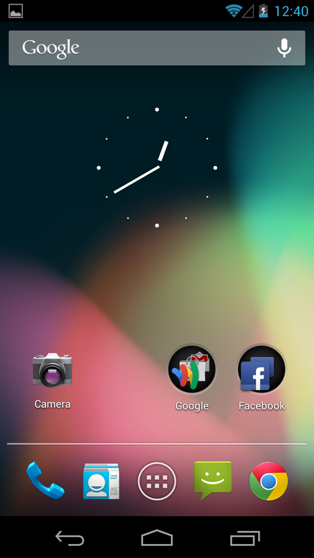
So here is the home screen of stock Jelly Bean. The layout is simple and beautiful. At the bottom you can see the on-screen keys which consist of "Back", "Home", and "Multitasking". "Back", as the name implies, takes you to the previous screen that you were on within the app. So if you were in Chrome, it would take you back a page. However if you were at the first page that launches say in a new tab, it will only take you back as far as that homepage. Store this bit of info real quick like and remember it when we review Windows Phone. The "Home" button will take you to your home screen which is shown above. If you long press or swipe up from the bottom you can quickly access the Google Now app which is very handy. More on that later. Finally the "Multitasking" button will show you all of the apps that are currently actually running in the background. Again, more on that later.
Another feature on here are the simple folders set up on the screen. Like iOS, all you have to do is drag an app above another and then "drop" it to create a folder. In my case I made a folder for Facebook (and its messenger app) and another one for all things Google.
Finally, the apps at the bottom that "stay" there when you switch screens. These are your go-to apps that you probably use most. I kept it simple and kept the phone, contacts, messaging and Google Chrome.


Above, you can see the two other pictures of what navigating through Android looks like. In the past, transitions in Android have been a bit laggy or stuttery, but "Project Butter" running at 60 frames per second was the solution for better responsiveness.
I have my layout very simple for myself, but you can customize as much as you want which is the great thing about Android; you can do whatever your creative heart desires. However it may take some extra work to do this, which may deter people from Android. Then again, this is the beauty of Android. It being open-source, if you don't like the looks then go online to XDA Developers and figure out how to change it yourself.
I have my layout very simple for myself, but you can customize as much as you want which is the great thing about Android; you can do whatever your creative heart desires. However it may take some extra work to do this, which may deter people from Android. Then again, this is the beauty of Android. It being open-source, if you don't like the looks then go online to XDA Developers and figure out how to change it yourself.
The third image to the right is the app drawer. To launch it all you do is press the middle button in between the contacts and messaging apps. It is very simple to use and is analogous to the entire iOS operating system. Please don't get your panties in a bunch; I prefer my iPad as my tablet of choice for what I need. Like I said earlier I enjoy all mobile OS's. Getting back on topic, if you swipe all of the way to the right you can find your widgets.
Not all apps have widgets, but in my opinion its not a deal-breaker. Adding apps or widgets to any of the screen is as easy as long pressing and dragging it out. You can see the Shazam equivalent widget on the first picture and underneath, another widget that is a quick access to controlling your music. Finally, the settings control widget. You can turn wifi, bluetooth, GPS, syncing and brightness on or off with just a tap. These are just a few example of what widgets are.
Windows Phone 8: A Diamond in the Rough
Here we go. The Windows Phone 8 UI. Should be fun trying something new right? RIGHT? Well if you are transitioning from iOS then you may actually enjoy it. If you are one of the few brave Android souls, you are probably going to despise it, much like I did for the first few days. However, if you keep an open mind and get the negative fanboy thoughts out of your head I think you may be surprised.
In Windows Phone 8, you are given this home screen that is filled with what feels like absolute chaos. Yup, I used the word chaos to describe the USER INTERFACE. Different sized "tiles", as they are pronounced, are cluttered all around this infinitely scrolling mess, depending how many apps you wish to "pin" to the startpage. In spite of this arrangement, it actually started to grow on me after about a week. Navigating around Windows Phone is super sleek without any stutters at all, which surprised me due to all of the fancy animations when switching apps and such. Compared to Android it is a lot more smooth and possibly on the same level as iOS.
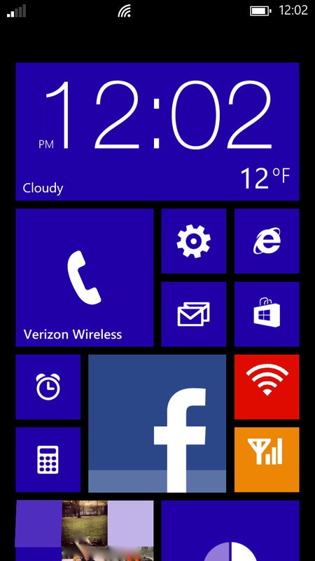
At the top you can see a bar, much like Android, that shows signal strength, wifi connection, vibrate, battery life, and time. This was my first annoyance with Windows. In order to see it, you need to swipe down from the top on only the home screen...and then it will stay there for about 10 seconds until disappearing into oblivion. WHY ARE YOU SO INTROVERTED INFO BAR?! WE WANT TO BE WITH YOU! I have no idea why Microsoft decided to have their programmers decide to code it with social anxiety, but I can only hope that it will get updated in the future as a setting where you can choose to hide it if you wish.
So now the Live Tiles; yeah, those things that Microsoft markets the hell out of on tv. What are we to say about them? Are they going to make me a sociable chef like Cam Newton? In case you forgot...
I guess it is plausible, but then again, that is what marketing is all about. It took some time, but I do like them. A lot. They are essentially the bridge between Android and iOS. Live Tiles are somewhat customizable and yet incredibly simple like iOS. You can rearrange them as much as you want too. Four smalls fit in the same space as a medium, two mediums in the space for a large, or eight smalls in a large. Got all that?
To the android user, you may laugh them off because the only customization that you can do is resize them from small, medium, or big and change the color. Yeah that's it, but there is something nice about it. That simplicity is what made iPhone a success because people "just want it to work". You cannot imagine how many times I've heard that phrase come up with Apple people, but iOS users will most likely favor the tiles because they are new and iPhone is starting to act its age (aka your grandmother's smartphone). Something about the Live Tiles makes it feel very personal and fun. Believe it or not Android community, aesthetics are a heavy consideration when making a two-year investment.
To the android user, you may laugh them off because the only customization that you can do is resize them from small, medium, or big and change the color. Yeah that's it, but there is something nice about it. That simplicity is what made iPhone a success because people "just want it to work". You cannot imagine how many times I've heard that phrase come up with Apple people, but iOS users will most likely favor the tiles because they are new and iPhone is starting to act its age (aka your grandmother's smartphone). Something about the Live Tiles makes it feel very personal and fun. Believe it or not Android community, aesthetics are a heavy consideration when making a two-year investment.


In the above pictures, you can see my layout for the Live Tiles. My clock/weather widget is a large tile because it reminds me oh so much of that amazing HTC Sense UI widget on my DROID Incredible. It also shows the most information because it is the biggest size. So if I changed my messaging app from medium to large, it would give me a description of the text. The tiles update and flip whenever new information is available based on background data settings. Some of them are purely for looks, like the People tile. All it does is flip between different pictures of your contacts. It's this little thing that I like that makes the Windows Phone 8 experience fun and interactive. They are widgets...they are app shortcuts...they are Live Tiles.
Now there is something that I am not too particularly fond of, but I can live with it, and that is the app drawer/very long frickin list. Swipe to the left on the start screen and there it is. Depending on how many apps you have, it can get quite lengthy. Oh you want to access your Wallet app? Have fun scrolling for an hour or so. Ok, so maybe it isn't that bad, but it could get annoying.

Placing your apps on the start screen is easy. Just long press and choose "pin to start" and it will appear there. Best thing about the app drawer? Carrier bloatware ceases to exist...for good. In Android you can disable the preinstalled apps but not actually get rid of them unless you root your device. I have no idea how Microsoft leveraged this but if you don't want that pesky VZ Navigator app just choose "uninstall" after long pressing. Haha nice try Verizon.
Winner?
For the user interface I will not declare a winner at all. I simply cannot because my views do not reflect the entire population of potential smartphone owners. To say one is better than the other is childish and completely relative. This is why they call it the USER interface because its up to the user to decide if it is worth buying. I will say that the only downfall is Androids lagginess due to fragmentation (unless on a Nexus device). Even with Project Butter there were times I noticed a minute stutter that I have yet to see on Windows (but then again I'm a stingy techie who looks for mundane things like this and the average consumer would most likely not even notice).
If you want freedom and customization for a UI, but with a learning curve go for Android. If you want one that is smooth, sexy as hell, but not as customizable, go for a Windows Phone.
If you want freedom and customization for a UI, but with a learning curve go for Android. If you want one that is smooth, sexy as hell, but not as customizable, go for a Windows Phone.
Go with: Either
File Transfer
Google Android: Just drag and drop
In order to put files on your Android device, as the title implies all you have to is drag and drop. Really, its that easy. On Windows 7, just plug your device into your computer and it will show up as removable storage. Drag your music, files, or pictures to [or from] your device and it will automatically place them in the correct folders.
If on a Macintosh, you first have to download the Android File Transfer app. This will allow your do-everything, OSX-enabled computer to recognize that your Nexus is plugged in. Again, drag and drop files on and you're good to go.
(click the image below to see a bigger view)
If on a Macintosh, you first have to download the Android File Transfer app. This will allow your do-everything, OSX-enabled computer to recognize that your Nexus is plugged in. Again, drag and drop files on and you're good to go.
(click the image below to see a bigger view)

Windows Phone 8: Yes, it's compatible!
Obviously if you are on a Windows-based computer you are going to find it extremely easy to transfer files over because it will automatically tell you to install the free app upon plugging it in. The app is basically the same as the one for Apple users.
Yes Apple people you are in fact compatible! Go to the App Store and search for Windows Phone (Microsoft Corporation). Download it and voila! You now can transfer files to your Windows Phone! Not as scary as one might think, eh?
Yes Apple people you are in fact compatible! Go to the App Store and search for Windows Phone (Microsoft Corporation). Download it and voila! You now can transfer files to your Windows Phone! Not as scary as one might think, eh?

Once you plug in for the first time you will have the option of "naming" your device, much like if you plugged an iPod into iTunes for the first time. Again, this gives a bit of personality and closeness to your phone. The app itself feels a lot like iTunes actually. In the gallery below you can see the sync options for songs, videos, etc...there is one weird thing about this. You need to authorize the music folder for example in the settings for it to sync properly or else it will have a warning that says "some of this blah blah blah is protected by blah blah".


One great feature about the Windows App is that it can import your pictures/videos taken on your phone to iPhoto automatically. This is particularly useful since the HTC 8X has limited storage.
Winner?
I would have to give Windows a slight edge on this one only because the Windows Phone app is very intuitive and makes Mac people feel at home. It also allows for automatically importing of media for the average user which is a big plus instead of manually transferring from a pictures folder.
Go with: Windows Phone
Cloud Storage
Google Android: Where's all my stuff?!
Now I know you're thinking, "That title doesn't sound good at all", but just hear me out. There is a reason for my catchy phrases. So let's go with the positives first. Plain and simple: you are never without storage. Seriously. On Android you have a plethora of cloud storage options. Below you can see all of the different cloud services that you could download (and there are even more to choose from).

What is amazing is that you can have more online storage than you physically have on your phone. I have the 32 GB Galaxy Nexus and with all of these combined I have a total of 75 GB. That is more than enough for me who frequently takes pictures and video. I regularly use Ubuntu, Dropbox and Google Drive (and recently SkyDrive due to the Windows phone).


Not sure if this is a negative, but the only problem with having this many options is that sometimes you can forget where all of your stuff is. It is basically a first world problem of cloud storage. I have from time to time completely forgotten where I have uploaded a particular document, powerpoint, picture or whatever. Obviously I can find it within a minute or so of quickly switching among apps, but still its more of an inconvenience in this Information Age where we need everything on demand instantaneously.
Windows Phone 8: Well at least I've got something...
So here is where you start to see Windows Phone 8 struggle. So far the only two cloud storage options that I haver are Box and Microsofts default option of SkyDrive. Yep, that is it. I have 5GB on Box and 7GB for SkyDrive giving me a total of 12GB. That's almost not even a 1/3 of my total for Android! So combined with my 11GB of physical storage on my phone (yeah not actually 16GB, thanks HTC) I have a whopping total of 23GB. Not even close to the total I have for my Galaxy Nexus physically.

Obligatory SkyDrive screenshot...ain't it pretty?
So having only two options for cloud storage is a real pain in the you-know-what, but that is because the developers aren't exactly flocking to the Windows Phone app store. Give it time and hopefully they will. Realistically you really don't need the aforementioned 43GB of storage for Android. Just having all of my stuff on Box and SkyDrive was nice because I knew that my files would be in one or the other places, which made it easy. Below are a few screenshots of what SkyDrive and Box look like on Windows Phone 8. Obviously SkyDrive wins here on Windows Phone 8 the way it is set up because it was built for this mobile OS. Google Drive obviously wins on Android for the same purposes.


Winner?
There really is no comparison here: Android wins hands down. The fact that you can find and use whatever dedicated Android cloud storage app you want to sets this apart from Windows Phone 8. Oh yeah and you can get SkyDrive for free on the Play Store (not the other way around) which in my mind sealed the deal for this mini-battle.
Go with: Android
Camera app/Pictures
Android: Gold standard (may as well skip this section)
As if the title doesn't give enough clues away, the camera and pictures apps in general are near perfect. Unfortunately I could not take screenshots while in the camera app because my Galaxy Nexus was being stubborn. We should forgive him for his inconsiderateness because his actions speak louder than screenshots. Not sure if that sentence really says what I want it to, but it has already been typed and I only look forward. Kind of what Google does with the camera apps. For the longest time I was able to take panoramic pictures with my android phones way before Apple bombarded us with commercials of how great this new camera feature was.


Above you can see the picture app (left) and the camera app (right). The pictures app is clean and neat. Very straight forward and easy to navigate. The camera app has tons of features and settings to choose from, but again I couldn't take screenshots so you will have to take my word for it. Trust me though, Android's camera is leaps ahead of the industry and it has gotten even better in Jelly Bean 4.2.
Windows Phone 8: A noble effort
Microsoft tried something a bit different with their camera which can be good and bad. Instead of having a panoramic setting built-in to the camera, you instead have to download, from the app store, a panoramic camera app. Yes, you actually have to waste valuable phone storage space and download an app just for settings or features that are already preloaded into Android's camera. These particular features actually have a name and are called "Lenses". Very creative.

However, there are some neat ones that are quite useful such as "Blink", "Bing Vision", and "Translator". Blink is just a feature that allows the camera to take about 30 consecutive quick shots within about 3 seconds. You then can take your pick of your best pic. "Bing Vision" is basically a barcode/QR code scanner just like Google Goggles (which is better in my opinion). "Translator" is very useful because it can scan any printed text and then convert it to any language you want. It really is pretty amazing and I actually appreciated this one the most (but have absolutely no idea of its accuracy). With updates it should get better like any other app.


The layout for the photos app is much like Androids, but a lot more artistic so-to-speak. The top left image shows different categories to choose from just like Android, so there really isn't a advantage to either. You can also swipe across to find online albums from your Facebook friends. A nice touch is that the background will cycle through images saved on your device if you want it to. It also does this for the Live Tile. Again, going back to that whole "personal" theme which I really like.
Winner?
Camera-feature-wise it is absolutely no contest. Go with Android. You won't have to fuss around with downloading ridiculous lenses from the Play Store. Everything is already there. A lot of people are big into taking pictures and I feel like it should be an important factor when considering a smartphone purchase, but some of these nuisances you can deal with. I'd rather have amazing picture quality than features, but that's just me.
Photo-management-wise it is pretty much even Steven. Android's is clean while Windows Phone's is individually unique.
Go with: Android
Music
Android: Can you hear me now?
Alright I figured it was time to start getting into some of the juicy stuff. So here are the pros. Like all things Android you can customize every little setting for your music to your heart's desire...even more so than iOS. It has a real equalizer that allows you to change individual ranges of frequencies which is a big plus in my book.
You can search your library very easily with the magnifying glass and can find similar songs on the Play Store.
If you want to skip ahead in a song all you have to do is touch the dot and drag it to anywhere within the line. Might seem like an intuitive feature, yeah? Well remember that for Windows Phone.
I also really like that I can quickly access my music and switch songs without having to go into the app specifically due to on-screen widgets or simply pulling down on the notification bar.

As for the cons, there aren't many and they are not that significant. If you want to turn your phone it will go into landscape mode which I think is alright, but not needed at all. I guess the only reason you would require it is if you have a media dock, but I can't say that I've ever felt the need to have one as they really aren't worth the price.
Going back to the equalizer, if you are a bass-head you may be disappointed. Even though it can be cranked up really high, it doesn't really give it that "punch". Yes, this is due to hardware limitations of the Galaxy Nexus, but I'm trying to compare one of Android's best phones that comes up short in this department.


Also there are "Like" and "Dislike" buttons to choose from while listening to a song. I really am not sure why you would dislike a song that you personally put on your own phone, so if you have an explanation to this please feel free to tell me!
Now the final con: aesthetics. Even though it is a completely fine app and does more than what most people want, it just looks lackluster. I originally liked the cool blue look for stock Android, but it now seems dated to me. It is just "meh". This is purely my opinion and you may think otherwise.
Windows Phone 8: Simply fun with a bit of Beat[s].
You're probably thinking to yourself: "This is one of those stereotypical college guys who thinks Dre Beats are the most amazing sounding inventions that ever did be invented. He love dat bass". Actually I really do not like Beats headphones at all. They sound bloated and are not balanced at all acoustically. I prefer my Sennheiser HD-25ii's with my FiiO E11 amp. Now that we got that out of the way, when I say Beats on the HTC 8X is pretty awesome...I mean it. Now I realize that this is exclusive to HTC phones, Android included, but it is something that I believe makes this Windows Phone experience a lot better. With the better built-in amp, the music has a lot of depth to it and I actually enjoy listening to music through the speakers. It also has enough punch to drive my headphones.

The music app is like all other things Windows Phone: artsy. If focuses on playing music, finding music and showing music. Really that is about it. This is good thing though for people who want a completely functional music player that is much like iOS and doesn't have a learning curve. I actually enjoyed this a lot. For the first time in four years I actually started taking my Windows Phone to the gym to workout with. I never took my GNex and don't really regret it.
The layout for navigating your music is just like every other part of the Windows Phone OS. Swipe to the left or right to change what category you are looking at. You can also click on the letter in the green box to quickly jump to all other songs/artists associated with that letter. Again, not the most innovative or exciting way to search, but it gets the job done.


Probably the best part of listening to music is the album art. This is a vital part of the Windows Phone 8 experience especially with the Live Tiles. When listening to a song, the album artwork shows up like any other music player, however behind it, there is secondary art for the particular artist. Not every song has it, which is kind of disappointing, but for the ones that have it make up for it. The Live Tiles show this secondary artwork and scroll through the artists name in various transitions that just make another part of the OS fun.

Want to change the volume? Better give you the option to play music!
Now I only have two real complaints with the music app. First, there is absolutely no way to skip ahead to an exact part in a song. With Windows Phone, you don't have the luxury of having the scrollable dot that our iOS and Android superiors get to bask in. In order to skip ahead you have to literally use a fast forward button by pressing and holding until you get close to the desired location. Given, it is pretty darn accurate, but c'mon Microsoft this isn't 1994...we are out of the VCR era.
Another annoyance is the volume rocker. If you just want to silence your phone by clicking the volume-down button there is the possibility that you will start to play music EVEN IF YOU CLOSED THE APP OUT. No idea why this happens. I can click the back button 900 times to clear out all of the "multitasking" apps and I still have the possibility to control the last song played every single time I change the volume. I would really like this to be fixed in some way as there is nothing more embarrassing than trying to mute your phone during class only to have it actually start to play music.
Winner?
This one was tough. Both of these players are good in their own way. Even though Android has a plethora of options, I think I will have to give this round to Windows Phone 8 purely due to the design of the UI. Android's player, like I stated earlier, just feels plain and dated. Something about Windows Phone's makes me want to listen to music. While it may serve no functionality whatsoever, I simply love that secondary artwork behind the album or on the Live Tile.
 RSS Feed